Hi Guys!
Well I'm only just learning myself but a few of you have asked for some tips on coloring with Kraft and I said I would share what I know thus far. I'm sure there's as many ways to do it as there are crafters but this is my way and I hope it can help someone else.
To begin with Kraft is a rough toothed paper. So you will find you can add more layers of pencil lead than ordinary cardstock allows. This gives the effect of using pastels or chalks.I also use a firmer pressure than I normally would ,so this results in more pigment being put down.
I do not blend with any solution. I simply use my pencil pigment to blend.
You'll see.
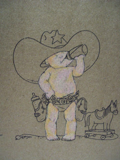
Below you find
Baby Tex in all his naked glory. (a
mo manning image.)
I have given him an all over color in
Cream.(I will be using Prismacolors)
He looks kind of like that African tribe that smears themselves in white clay at this point. lol
Don't worry, he'll improve.
Picture 2:
Light peach
Picture 3:(below)
Jasmine
He's looking a little scary right now but bear with me, ok?
Picture 4:(below)
Beige
Picture 5: (below)
blush pink
he's starting to look a little more human now, but still has a ways to go yet...
Picture 6: (below)
Peach
Picture 7: (below)
yellow ochre
now, I need to say that from this point forward I am only using the new colors in some areas of the baby. Not an overall coating. This is where your shading skills come in. You add the next few colors in your shadows because the colors we're using now are beoming progressively darker. ok?
Picture 8: (below)
mineral orange
he's really coming alive now isn't he?
Picture 9: (below)
Pink
Picture 10: (below)
Black
I can hear you say "What the......."
the black is to go over the lines that have become a little covered over. :-)
See? Looks good, right?
Now we'll start on the hat. I am using here:
Burnt ochre
Now fill in the center with beige and add some terracotta to darken a bit of the brim.
Go back in with the brown ochre to soften the edges and merge the colors.
Use the same colors for the holsters.
(below)
Now use some lemon yellow for the star as well as sunburst yellow for darkening your shadows.
The blue you're beginning to see is mediterreanean (sp?) blue and cloud blue
also some white.
For shading your white (the horse and diaper) use white, french gray 70%, 30% and black
Looking at the ground in the picture (above) you'll see I've put down some sepia to start with.
I've then added some beige. (below)
Then added some lime peel (below)
and darkened my shadows with Dark Umber.
To finish I used non photo blue to outline my image.
So now the little guy is ready to be put on a card.!


.jpg)


