Monday, July 30, 2012

Things Can Only Go Up

Hi Everyone!
Thanks for stopping by :)
This is my last post for The Kraft Journal. It has been an awesome 5 months working with them. I would have been with them another month there if it weren't for a bad case of "Blogging Burnout". Ever catch it? Its scary. You wonder if you'll ever be in the groove again. *sigh*
In the past month or so I have come off some really wonderful teams and I  hope that someday they'll have me back.  For now I need a break to get my swing again. I have no intention of stopping blogging I just need to lighten the load a bit.
So back to this week's challenge:
Use Any Sketch
Here's mine:

Recipe:
Paper: Cosmo Cricket and Kraft
Image: Mo Manning "Going Up"


Thats it from me!
 I'm taking a blogging break for a week or two so bear with me and I'll be back soon.
Happy Crafting!


Thursday, July 26, 2012

A Boy's Best Friend

Hi Everyone!
This week our challenge at Mo's is:
In The Dog House
(interpret that how you will. In this country we have the expression someone is "in the doghouse" if they're in trouble and being punished. You could use an image like that. Or you can go the doggie route. Either way!)

*remember, you stil have some time to make up a card and join in our GD call. Just put GD after your name.

Recipe:
 IMage: Mo Manning, prismas and Lyras on kraft
Papers: MME
Ribbon: Crafty Ribbon
Button: Home Sew

Can't wait to see your projects!


Monday, July 23, 2012

Some Things Just Stink

Hi Guys!
This week at The Kraft Journal we want to see cards that make us smile.
I'll admit that this isn't your typical "happy" card but rather a commiseration card. The sentiment fits and hopefully that will grab a smile from the recipient. 
 If not, my efforts have gone down the toilet. ;)

Recipe:
IMage: Mo Manning
Papers: MME, buff cardstock
Colors: Prismacolors on Kraft

Hope to see you all around Blogland! My blogger dashboard is finally working normally so its easier for me to blog hop. Thanks for bearing with me. :)


Thursday, July 19, 2012

Bedtime Story

Hi Everyone!
Well we are on week two of our GD call at Mo's Digital Pencil! For all you hopefuls out there you have til the end of the month to enter in our challenges and put GD after your name to be considered.
Exciting times!
So this week's challenge is:
Hugs and Kisses
I decided to use Mo's "Bedtime Story" for my card. Its an older image and is not listed in the new shop yet but if you put a flea in Mo's ear she will definitely add it, no problem.

I've used prismacolors and Lyras on kraft cardstock and various scraps of designer paper. The burlap, twine, vintage ticket stub and cardboard button are from The Kraft Outlet and ticket sentiments are Whimsy. I used distress inks and white craft paint to add age and interest.

Thats it from me! I can't wait to see all your projects and have a wonderful weekend!

For my latest sewing project , click here.


Wednesday, July 18, 2012

Coloring Steel on Kraft Cardstock


Hi Everyone!  
 I thought you might enjoy playing around with achieving a "metal effect" on kraft cardstcock,so to get started find an image with a chunk of metal you can work on and get some kraft paper to print it out .
I am here using prismacolor pencils in this demonstration but you could use other brands just keep in mind that the names on the pencils will be different. And just a FYI : for metal we would generally use cool grays as opposed to warm (or brownish) grays.
OK! So I've written the steps on the photos below. Have fun!


When you go onto step 2, blend the 70% onto the 90% .You will go over the first layer somewhat and outwards. Just try not to "drown out" the first, darkest layer.

Really we're just taking one full color range of grays and working our way from darkest to lightest. 

I just love how the colors start merging now. Its really starting to look like shiny stainless steel.

Ah! I love this! Can you see it coming together? I can almost hear the clang!

OK, so now we're going to grab some of our previously used pencils to blend it out a bit. We don't want any "color transition" streaking.

And reinforcing the darker colors (below)...

Add a few punches of detail....


And the hardest part: knowing when to stop!


I hope you had fun! 


Thursday, July 12, 2012

Cutting The Rug

So here's a happy card for you!
 What's not to love about this image! Isn't it great? I tried something a little different here. I used my trusty pencils, as usual,  but I colored on pastel paper (as in for pastel pencils, not pastel colored paper). It has more tooth to it which can be good and bad. You can get a lot of pigment down but it does still leave a texture as pencils don't fill in the tooth as much as powdery pastels would do.
Anyway! It's good to experiment!
So this week's challenge at Mo's is
Singing/ Dancing

Recipe:
Image: Mo Manning "Cutting The Rug"
Circle sentiment: Whimsy Stamps
Die: Sizzex
Twine: The Twinery
Pencils: Lyras and Prismacolors


Hope you enjoy the challenge this week. :)
Have a great weekend!
ps) For the rest of July we will be having a Guest Designer Call at Mo's so be sure to play along with the challenges and put GD after your name to be considered!! The GD position will last 3 months. So its kind of a big deal ;)
All the best!


Monday, July 9, 2012

Rock A Bye Baby

Hi Guys!
So its "Rock-A-Bye Baby" at the Kraft Journal this week!
Time to get out your wee wittle buttons and soft happy colors and get caught up on baby cards. :)
I chose to make a clean and simple card. At least, its as clean and simple as I get. I liked the simplicity and serenity of the image and just didn't want to "disturb the peace" with too many embellies.
Hope you think it was a good idea, too. ;)

REcipe:
Image: Mo Manning, "Diaper Crew"


Hope I haven't put you to sleep!
Have a great week, everyone!


Thursday, July 5, 2012

The Midnight Oil

OK Guys so look at this.
No matting! 
OK, there's one mat but its black. Is this a first for me? I thinkie so.
I just felt like doing something totally different. I think its the artsy image brings out the eccentric in me.
I even got out the white craft paint and went smudgy with it. How fun is that!
OK, so can you guess what the challenge is this week at Mo's?
You guessed it!
Anything Goes!

Recipe:
Image: Jo Painting by Mo Manning
Colors: Prismacolors and Lyras
Kraft paper pack, button, ticket stub and burlap: The Kraft OUtlet


So I can't see what all you creative minds come up with this week!
Happy Crafting!

Challenges:
Paper Pretties - any occasion card
Scrapbook Sisters -  one stamp
Tandastamps -- Splish, splash & Splat (throw paint, ink, water ect)
Waste Not Wednesday  always "use your forgotten stuff" (white craft paint)
Card Cupids Use ribbon, twine or washi tape
Cupcake Craftroom -  - Lots of layers


Monday, July 2, 2012

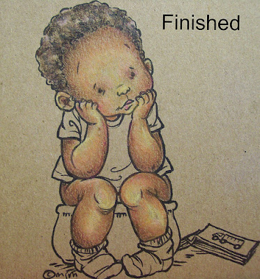
Coloring Dark Skin on Kraft

Hi Guys!
So as promised, I worked up a step by step for you in coloring ethnic skin tones on kraft. 
I was a little more ' in my element ' doing this one and I hope you like it.
The colors are very similar to what you would use on white paper (see tutorial for white here) with this one difference: Because we are looking for a darker shade of skin there is no need to start off with whites and creams. In fact, this is where kraft is in its element because we're halfway there before we start. ;)
OK! So lets get started!

Step 1 we're going to work the shadows with light umber. Just nice easy circular strokes.


Follow the umber with (step 2) burnt ochre. So you're covering the light umber with the burnt ochre and coming in toward the center just a bit further.


Step 3) All over with goldenrod. (below)
He's looking a little jaundiced at this point but don't panic.


Step 4) working the shadows with sienna brown.


Step 5) begin blending with pink (very lightly) and add a wee bit of process red in the deepest shadows for "punch".

Steps 6&7)
ok, I know this looks like a lot but it isn't really.
The yellow ochre, jasmine and peach is a layering combo that works wonderfully to blend the tones together. If your image is too pinky peachy, add more yellow, if its too yellow, add more peach etc. You get the idea.

The dark brown is added in the shadows to re-depthen them. (They may have lost some depth with the blending).
It really starts coming alive now.


Step 8) This is just so exciting! Burnt Ochre and Dark Brown is used now for further contouring and depth.
This is where you get an inkling of what Geppetto felt when Pinocchio came to life.You know what I mean? It's like the image starts to breathe when your back is turned! lol


Step 9) The final magic touch: Black. Black grounds everything . It adds realism and the shadows darkest depths.
ps) I added the hair colors on the side in case you were wondering what I did.;)


And here he is all finished!
Really you could go in and tweak and tweak til the cows come home but at some point you've got to say "enough ".
It's a tough call.
But I think he's pretty cute as he is. :)


happy coloring!


You Take My Heart With You

Hi Guys!
I hope you all had a great weekend. :)
Today's challenge at the Kraft Journal was a little tricky for me cos I never put these colors together.
Red, White and Blue
I decided to use this theme to make a going away card for an older friend who is moving away to be cared for by her daughter. The tag pulls out and says, "Wherever you go you take our heart with you".
She's one of those people who can be at deaths door, gasping for a breath and when you ask her how she is she'll whisper, "Oh I'm all right baby how are you?"
She's such a sweetheart.

Recipe:
Image: Mo Manning
Colors: Prismacolors and Lyras
Paper: MME


Thats it from me today!
See you around Blogland :)


Related Posts with Thumbnails